

Life Insurance Quiz
Increasing customer engagement and conversion for the readers of Investopedia’s life insurance content.
Background
An application was developed with the goal of streamlining the work of correspondence for the end-user. The app enabled users to create, process, and monitor new and ongoing work items.
Objective
An application was developed with the goal of streamlining the work of correspondence for the end-user. The app enabled users to create, process, and monitor new and ongoing work items.
Step 1
Competitor Analysis
To begin, I researched a number of competitor quiz experiences within the life insurance space. I then collected assets from each competitor to catalogue, compare, and identify trends in the UI and content.
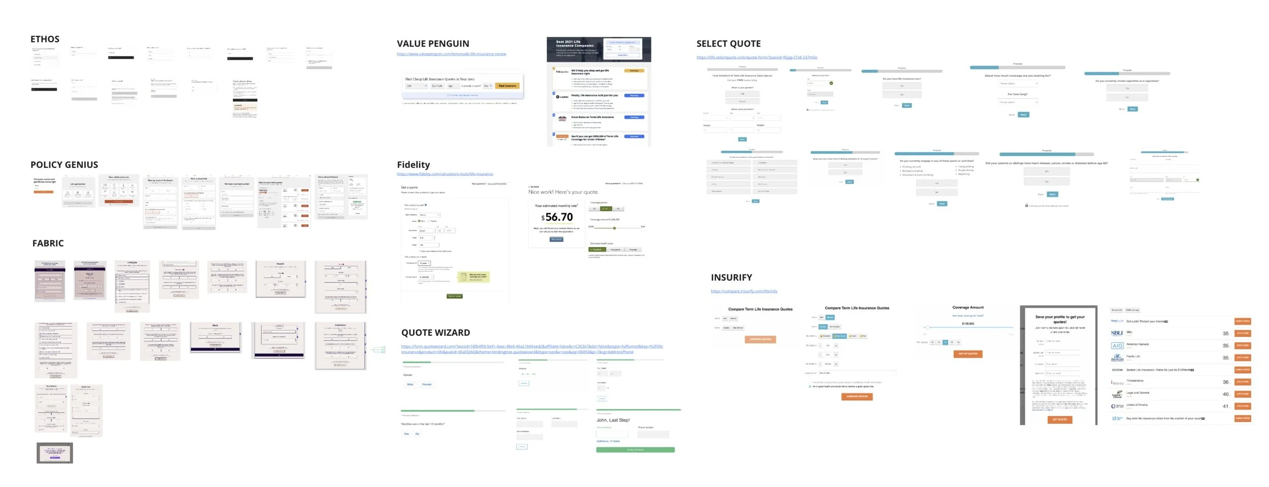
Competitor Trends
Quiz Results: How much will my life insurance cost / How much insurance do I need
Format: Traditional Calculator (Entry Fields w/ labels & a calculate button) or Questionnaire (Step by step modules)

Leveraging the questions and categories covered, I drafted a user flow to serve as the bones of the life insurance picker.
With all of the competitor data collected, I was able to determine which major questions were being asked of users.

Step 2
Wireframing the Flow
Pulling from the initial competitor analysis I started by desiging a flow of low fidelity wireframes. These were intended to layout a basic blueprint for the overall structure, layout, and key interactions without including detailed visual elements.
Low Fidelity
Mid Fidelity
Step 3
High Fidelity Prototype
With stakeholder sign off on content, I proceeded to apply Investopedia’s branding to the prototype. Leveraging their colors, typography, logos, and interactive elements.

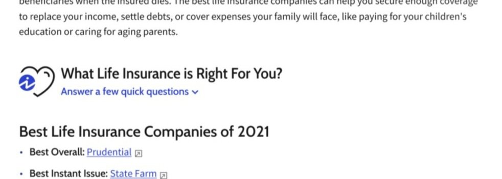
The Entry / Trigger point
Investopedia branded logo, colors, and fonts to insure seamless integration into content.
Bright, striking CTA button to catch the attention of the reader.
Copy intended to encourage the user to click/convert by communicating the speed and ease of the survey flow.

Question Flow / Survey
A series of only 3 questions asking for personal information
Chose to keep it simple and only ask 3 questions, to reduce cognitive load on the user. Additionally, responses for questions asked could be answered off hand.
Avoided asking for any information that could be considered more private. For example, health history, phone number, SS#, etc..

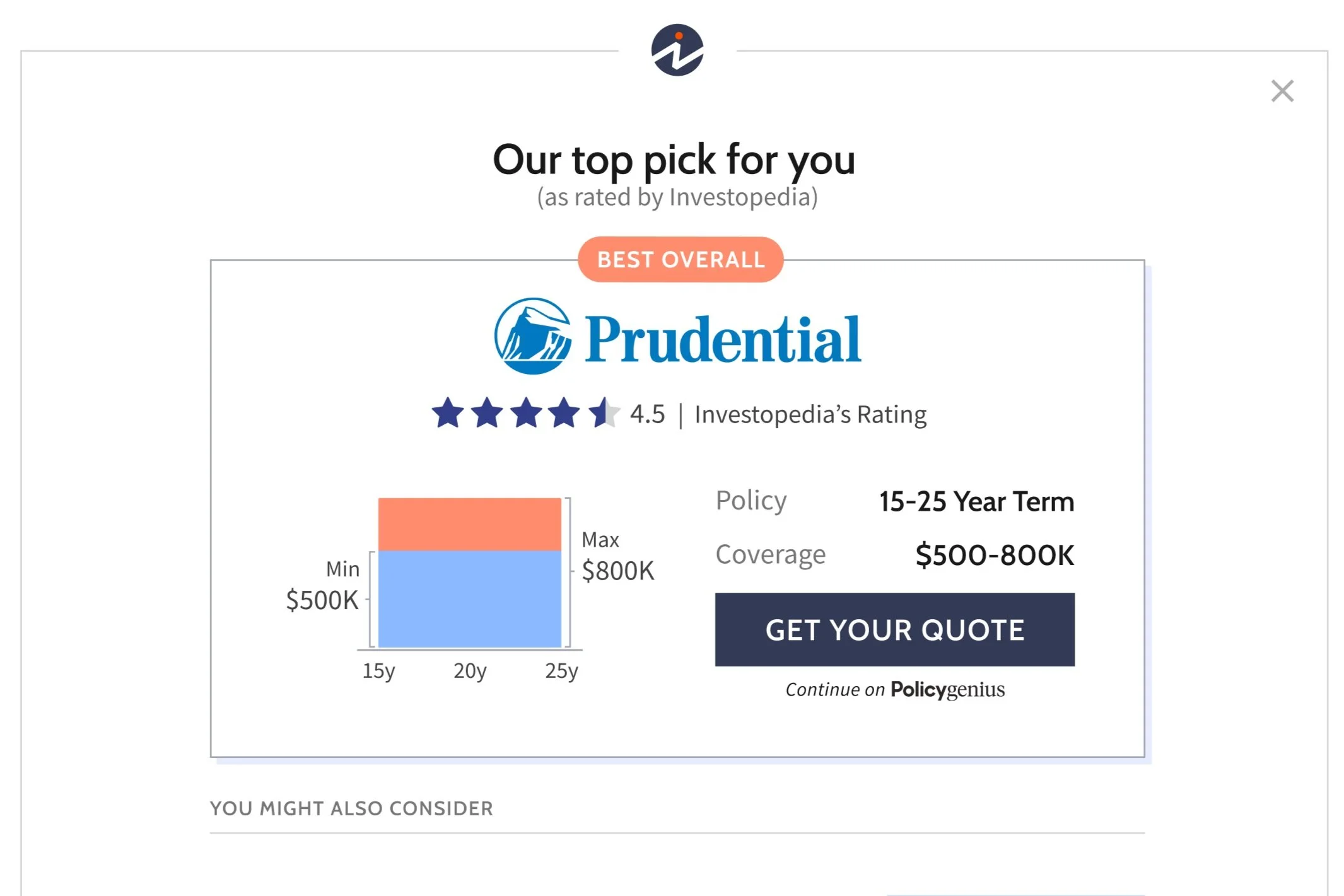
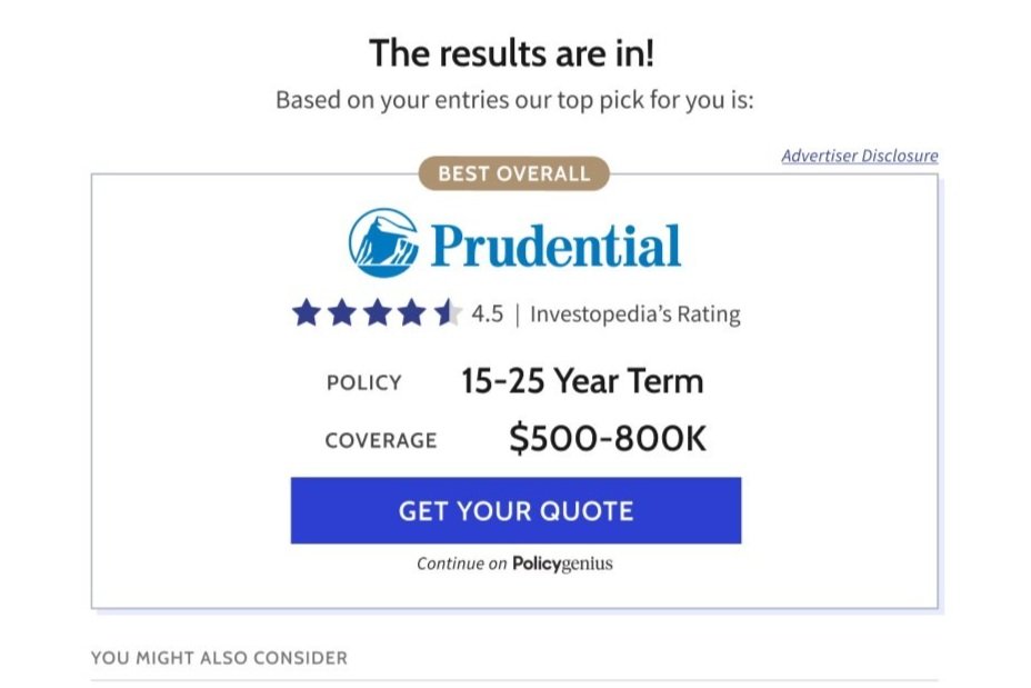
Recommendation Screen
Copy intended to instill the user with a sense of personalization; Results catered towards them.
Graphics to accompany the policy recommendation, to help explain what the policy could potentially cover.
Step 4
Validating with Users
With our High Fidelity Prototype completed, our attention now turned towards testing the quiz with users to identify any areas of friction in the flow. For this first round we would focus specifically on the entry point of the quiz.
Goals
Determine if quiz entrance is effective at engaging users. If not, then identify why.
Learn whether the final screen was easy to understand and would encourage convertion.
Identify any unforeseen frustrations within the questionnaire flow.
Methodology
I utilized the platform PlaybookUX to recruit participants for our testing. In this round I ran testing with 10 people total; 5 for desktop and 5 for mobile. In order to participate, users has to pass a screening test which asked whether they had researched or shopped for life insurance within the past month.
Test Results
“ It looks like it could be like a a scam website”
Tasks
Before clicking/tapping on anything take a look around the screen tell me what you see and what you think you can do here.
Locate the box where is says “Compare Best Life Insurance“. What do you think that is. What do you think would happen if you clicked on it?
Click through and try to complete the quiz.
“This is where they take your info, send it out to different companies, and you start getting a whole bunch of emails and calls about life insurance.”
0% of the participants noticed the quiz trigger.
One pointed out, almost all prticipants thought the quiz entry was an Ad or Spam.
Users did not understand what the graph on the results page was communicating.
Step 5
Redesigning with User Insight
With our first round of testing complete, my next step was to take the participant feedback and leverage it to inform the quiz’s design updates.
Entry Point
Remove border box around the entry point and left align it with the article, as a means to make the trigger appear better integrated into the article, rather than look like a separate sponsored ad block
Update the copy to feel less aggressive and more friendly & conversational.
Remove the large cta trigger. While it brought a greater visual presence, test participants associated it with scams and pop-up ads.
Before

Results screen
Remove the data visualization, since it led to more confusion than clarity in testing.
Focus attention more on the policy and coverage details, since they are the most important piece of information to convey.
Before
After
After
Step 6
User Testing Round 2
After redesigning the quiz I conducted another round of user testing. I recruited and conducted this test through Usertesting.com.
Goals
Determine if quiz entrance is more effective at being both noticed by user and encouraging them to click/interact.
Identify anything pain point within the experience, regarding interactions and ease of use.
Determine whether user still have concerns regarding being scammed/privacy.
“I would say that that is gonna give me a quiz and it’ll give me what is best for me based on my qualifications”
Results
None of the participants mentioned the words “scam” or expressed any concern about divulging personal data.
All users said that if they were looking for insurance they would click on the picker to learn more.
Multiple users also expressed that they felt it was a good way to narrow down their options, and determine what would make the most sense for them.
“If I was really interested in looking for life insurance I would want to see what it’s about. I’m trying to cut as many corners as possible to find the right insurance, so hopefully this would get me there”
“Looks like you’d answer a few question, a snapshot of your lifestyle”
Step 7
Hand Off to Dev
Following design validation from our end users I presented my final designs and result to a team of internal stakeholder. Upon recieving stakeholer sign-off I worked closely with a product owner to break down the experience into user stories for development.