Step 1
Overview
Teammates
Jonathan Van Risseghem
Timeframe
4 Weeks
Role
UX/UI Designer, User Researcher
Context
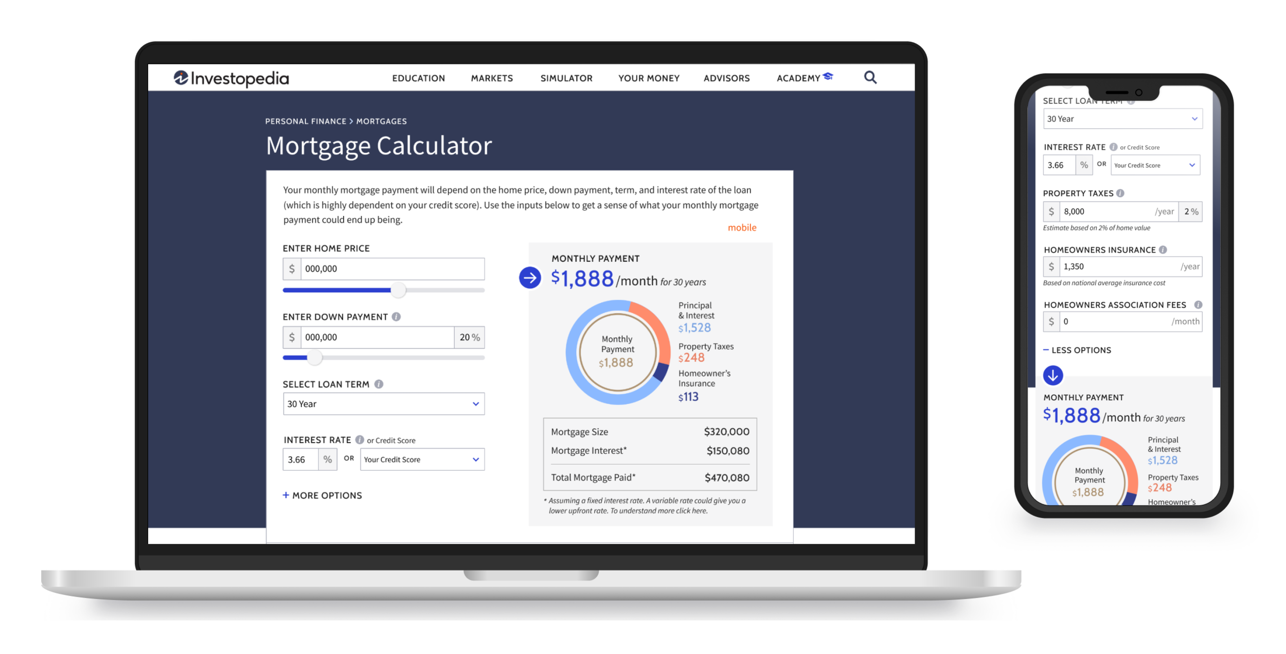
Investopedia’s Life insurance content currently accounts for a large percentage of the domain’s traffic and revenue. Stakeholder’s feel that this high traffic presents a great opportunity to further increase revenue by connecting readers with life insurance agency Policygenius. The objective is to design a life insurance quiz/picker that uses user inputs to provide a policy recommendation and then place them within Policygenius’s flow, to continue getting a full quote.
Objective
Investopedia’s Life insurance content currently accounts for a large percentage of the domain’s traffic and revenue. Stakeholder’s feel that this high traffic presents a great opportunity to further increase revenue by connecting readers with life insurance agency Policygenius. The objective is to design a life insurance quiz/picker that uses user inputs to provide a policy recommendation and then place them within Policygenius’s flow, to continue getting a full quote.
Step 1
Researching the Domain
To begin, I researched a number of different user flows in the life insurance space. I then collected assets from each competitor to catalogue, compare, and identify any similarities


Step 2
Mapping the Experience
To begin, I researched a number of different user flows in the life insurance space. I then collected assets from each competitor to catalogue, compare, and identify any similarities
With the different question topics identified, we drafted the first life insurance quiz user flow.

Step 4
Design
To begin, I researched a number of different user flows in the life insurance space. I then collected assets from each competitor to catalogue, compare, and identify any similarities

The Entry / Trigger point
Investopedia branded logo, colors, and fonts to insure seamless integration into content.
Bright, striking CTA button to catch the attention of the reader.
Copy intended to encourage the user to click/convert by communicating the speed and ease of the survey flow.

Question Flow / Survey
A series of only 3 questions asking for personal information
Chose to keep it simple and only ask 3 questions, to reduce cognitive load on the user. Additionally, responses for questions asked could be answered off hand.
Avoided asking for any information that could be considered more private. For example, health history, phone number, SS#, etc..

Final Screen / Recommendation
Copy intended to instill the user with a sense of personalization. Results catered towards them.
Graphics to accompany the policy recommendation, to help explain what the policy could potentially cover.
Step 4
Testing with Users
With our High Fidelity Prototype completed, our attention now turned towards testing the quiz with users to identify any areas of friction in the flow. For this first round we would focus specifically on the entry point of the quiz.

Test Goals
Determine if quiz entrance is effective at engaging users. If not, then identify why.
Methodology
Utilizing PlaybookUX, I recruited participants for our test. In this round I ran testing with 10 people total; 5 for desktop and 5 for mobile. In order to participate, users has to pass a screening test which asked whether they had researched or shopped for life insurance within the past month.
Tasks
Before clicking/tapping on anything take a look around the screen tell me what you see and what you think you can do here.
Locate the box where is says “Compare Best Life Insurance“. What do you think that is. What do you think would happen if you clicked on it?
“This is where they take you info, send it out to different companies, and you start getting a whole bunch of emails and calls about life insurance.”
“ It looks like it could be like a a scam website”
Actionable Insights
Most people did not see it, or chose to ignore it, while browsing the webpage.
People assume that the quiz is an ad due to its design (specifically the border box).
Once user progressed through the flow to the final result, they found that the results were confusing. Specifically, the use of the graph which visualized the coverage option.
Step 4
Incorporating Feedback
With our first round of testing complete, my next step was to take the participant feedback and apply it to the design of the quiz entrance.
Updated Design
The updated design was mainly focused on the feedback received regarding the entry point to the picker flow. To solve for this I changed the following:
Remove border box around the entry point and left allign it with the article, as a means to make the trigger appear better integrated into the article, rather than look like a sponsored ad block
Update copy to feel less aggressive and more friendly & conversational.
Remove


Step 4
Validating the Updates
With the new designs finished my next step was to run the same user testing done previously to gauge whether the updates had improved the quiz’s visibility and communication of intent.
Goals
Determine if quiz entrance is effective at engaging users
Identify anything else
Methodology
I again utilized the platform PlaybookUX to recruit participants for our testing. I ran testing with 10 people total; 5 for desktop and 5 for mobile. In order to participate, users has to pass a screening test which asked whether they had researched or shopped for life insurance within the past month.
Tasks
Before clicking/tapping on anything take a look around the screen tell me what you see and what you think you can do here.
What do you think the picker is? What do you think would happen if you clicked on it?
Is the picker something you would click on?
Test Results
Following the visual updates, none of the test subject mentioned the words “scam” or expressed any concern about personal data.
All users said that if they were looking for insurance they would click on the picker to learn more.
Multiple users also expressed that they felt it was a good way to narrow down their options, and determine what would make the most sense for them.
“Looks like you’d answer a few question, a snapshot of your lifestyle”
“If i was looking for insurance and wanted to get more info I would”
Step 4
Final Outcomes
With the new designs finished my next step was to run the same user testing done previously to gauge whether the updates had improved the quiz’s visibility and communication of intent.
Visual updates improved user sentiment and assumptions regarding entry point.
Overall the users felt positive about answering personal questions, and no longer were concerned about data privacy.
Once live conversion rate of picker flow increased double from 1.5 to 3% conversions.