Correspondence Tracker & Management Tool
Streamlining correspondence and optimizing dashboards
The Challenge
A federal policy clearance system was creating bottlenecks across the agency. Users rated it 5.4/10, citing confusion, time-consuming workflows, and lack of visibility. Policy clearances that should take days were taking weeks, creating compliance risks and delaying critical decisions for thousands of users.
My Role
Product Designer - Research strategy, interaction design, wireframing, high-fidelity prototyping, design system development, stakeholder presentations, developer handoff
My Approach
Analyzed existing usability test recordings to identify core pain points.
Conducted 1:1 interviews with 8 end users to understand workflows and needs.
The Team
Product Manager, Product Designer, Business Analyst, QA Analyst, Developer(3)
Timeline
10 weeks
Platform
Web App
Leveraged AI to synthesize interview transcripts, accelerating pattern identification by 3-4x compared to manual analysis.
Mapped user journeys to identify friction points across the correspondence lifecycle.
Collaborated with PM and BA to balance user needs with technical constraints and iterate on solutions.
Step 1
Define the Problem
At this stage, my goal was to define client goals, collect all existing data/feedback, and use these insights to establish a strategic redesign. Recordings of usability testing sessions were available.
Major Frustrations
1
2
3
Time Consuming Work Flow Navigation
Users were frustrated with how long it takes to navigate back and forth between the different steps of a work item.
“This is the part that actually sucks. I should be able to click on where I need to go, especially if I've already done those steps.”
Unclear Document Management
Users were unsure when uploading documents to a correspondence. They were unable to tell whether or not the document(s) had successfully attached.
“This is terrible. I have no idea where the summary came from. My additional notes are not there.”
4
Correspondence Uncertainty
When sending correspondence, users were unsure what steps they needed to take and whether everything they needed to send was included in their message. Emails sent from the system did not seem to match what they had seen earlier.
“This is terrible. I have no idea where the summary came from. My additional notes are not there.”
Disjointed and Dated Look & Feel
Multiple user as well as stakeholders reported that the look and feel of the application felt outdated and inconsistent.
“It looks slapped together. Not professional.”
Step 2
Researching the User
In order to obtain greater insight into the end-user of this application I conducted a series of 1 on 1 user interviews. I recruited participants with the help of the client, outlined the interview script, led all of the interviews, and and presented the findings to key stakeholders.
Personality
Resolute & Detail Oriented
Strong understanding of subject matter and the process needed to accomplish tasks.
Moderate tech saviness
Needs
Ability to complete tasks quickly and efficiently.
Proper transparency of the status of a task/project.
Ability to navigate and edit content seamlessly.
Frustrations
Improper use of terminology, acronyms, and other language.
Lack of flexibility when she needs to be able to edit content within a PC.
Late/overdue tasks that are held up by external factors/people.
Step 3
Ideation and Design
With the core user journeys, user persona, and the major usability issues determined, I began wire framing solutions.
Improving Visibility and Transparency
The Problem
Users struggled to interact with the existing correspondence form. They mentioned being unsure if they had properly attached a document and whether any additional notes they added had also been properly transmitted. Overall, they were uncertain if the message sent contained everything they needed it to.
Rethinking how work items are processed
The Problem
The ‘Active Status’ of a work item limits what actions can be done and what content is visible. In the example above, if a user wanted to send someone a document, they would first need to advance the active status to circulation. Navigating this way is incredibly time consuming for the user and also hides function from them.
The Problem
The existing dashboard was visually overwhelming, lacked visual hierarchy, and did not provide users with quick insight into their active work.
My Solution
Reimagine the processing flow of work items from a multistep pattern in to a singular screen/experience. With this new design users would be able to, see and update the active stage, use all controls available to them, and be able to view all correspondence and documents without having to advance the status and wait for a new screen to load.
Incorporating Actionability
My Solution
An updates ticker at the very top, to notify users immediately when a pending correspondence has been replied to.
Organizing their active work into 2 distinct buckets. ‘Ready to work on’ and ‘Awaiting response’.
My Solution
I addressed this uncertainty by redesigning the form to contain a preview of the message/request being sent out. This way, as users were to fill out the form and add documentation they could see a auto updating preview of what they were going to send out.
Establishing a Look & Feel
The client provided brand guidelines were limited to a color pallet. After some discussion I was given the freedom to expand upon their pallet and develop comprehensive brand guidelines, which include color, typography, iconography, and other elements.
I also leveraged Microsoft Fluent’s UI kit to assist in the development of the design system.
Step 4
Updating to High Fidelity
Following stakeholder sign off on both wireframes and look and feel, I designed high fidelity prototypes within Figma covering all core functionality and screens.
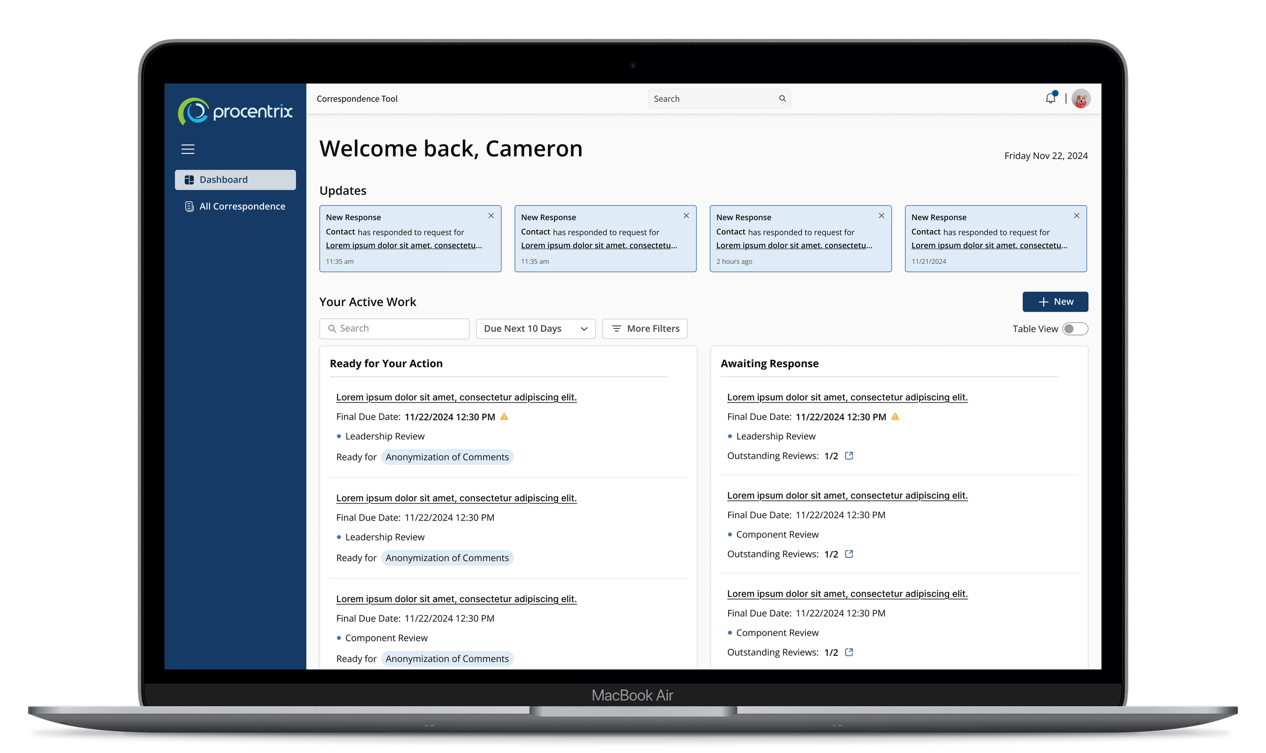
Dashboard Monitoring
Update cards to instantly notify users when a response to a request has come in.
Clear designation between which of a users’ active work is ready for them to take action on vs those that are still dependent on someone else.
Quick to scan status insights like final due date & “Ready for“ to help users make quicker more informed decisions when prioritizing their work.
Work Item Details
The details screen of a work item provides users with easy to scan comprehensive insights for a specific work item. This includes its active status, the owner of it, key details, and any correspondence and documents associated with it.
Correspondence
One central hub where users are able to conveniently monitor correspondence status, view details, and create new correspondence for a work item.
Allows them to multi select, extend due dates, and send reminders for existing correspondence.
Email Preview
One central hub where users are able to conveniently monitor correspondence status, view details, and create new correspondence for a work item.
Allows them to multi select, extend due dates, and send reminders for existing correspondence.
Step 5
Validating with Users
After completing High Fidelity prototypes for all of the core functionality of the tool. I conducted a series of remote usability tests with potential end users of the application.
“I know I can come in first thing in the morning and see what’s changed rather than having to go in and try to figure out like based on clearances.”
“It auto populated the summary which is great. It’s a lot less typing to find the offices that should be CCD”
“It’s easier because today it would be a lot more clicks for me to find the e-mail and be like, well, did I miss their reply?”
Client Sign-off
Once the user testing session were completed, I analyzed and presented the results to the stakeholders. I covered the goals of the project, research, design decisions, and lastly feedback of the final designs. Following this presentation, the client gave us to green light to move forward with the development of the new and improved tool.
Takeaways
The new dashboard took all the guessing out of what they should work on first.
All participants felt confident when tasked
Users felt the seamlessness of sending out correspondence.
Step 6
Hand-off to Development
I conducted an info session with our developers, in which I walked through all of the application’s core functionality and gave a demo to familiarize the team with how to navigate and use Figma.
I also included a control inventory report, indicating which components from Kendo UI are be relevant for the applications functions.

Final Impact
Following the successful development of the application, a series of UAT and User feedback session were conducted to ensure the product aligned with the customers goals and expectations.
Results
User satisfaction increased from 5.4/10 to 8.2/10 (52% improvement).
100% UAT pass rate - zero critical issues found.
Eliminated multi-step navigation that previously required 5+ clicks per task.
Reduced correspondence creation time by 40%.
Users described new tool as "intuitive" vs previous "terrible" and "slapped together".
Business Value:
Faster policy clearances = reduced compliance risk.
Eliminated user errors = less rework and support burden.
Improved visibility = better resource allocation.