Mobile Subpoena Request Management
Enabling field teams to create and manage requests on-site
The Challenge
Field workers were unable to create subpoena requests from their mobile devices, forcing them to delay critical work until they returned to the office. This desktop-only limitation created operational bottlenecks and reduced team efficiency. Additionally, the existing mobile app had an outdated UI that users described as "overwhelming" and "confusing to navigate."
My Role
Product Designer - User research, interaction design, mobile-first workflows, form optimization, high-fidelity prototyping, design system adaptation, stakeholder presentations
The Team
Product Manager, Business Analyst, Product Designer, Developer(4)
Timeline
6 weeks
Platform
Mobile IOS
My Approach
• Conducted user interviews with field investigators to understand workflows and pain points.
• Performed heuristic analysis of existing mobile app to identify core usability issues.
• Mapped all user journeys to understand critical vs. secondary functions.
• Prioritized mobile-first features: document creation, request monitoring, and approval signing.
• Designed stepped form flow to break down complex input requirements into digestible sections.
Step 1
Evaluating the App
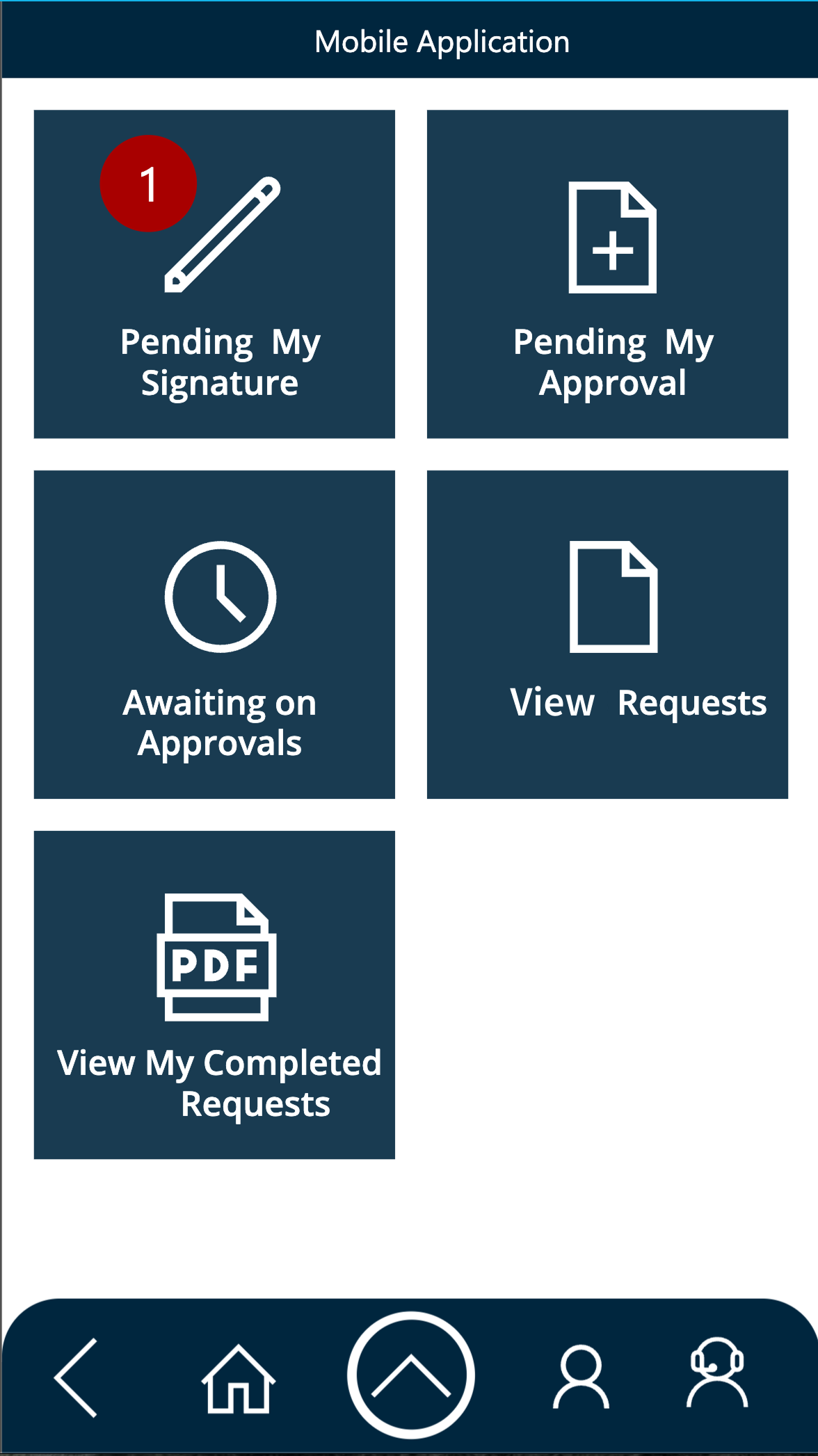
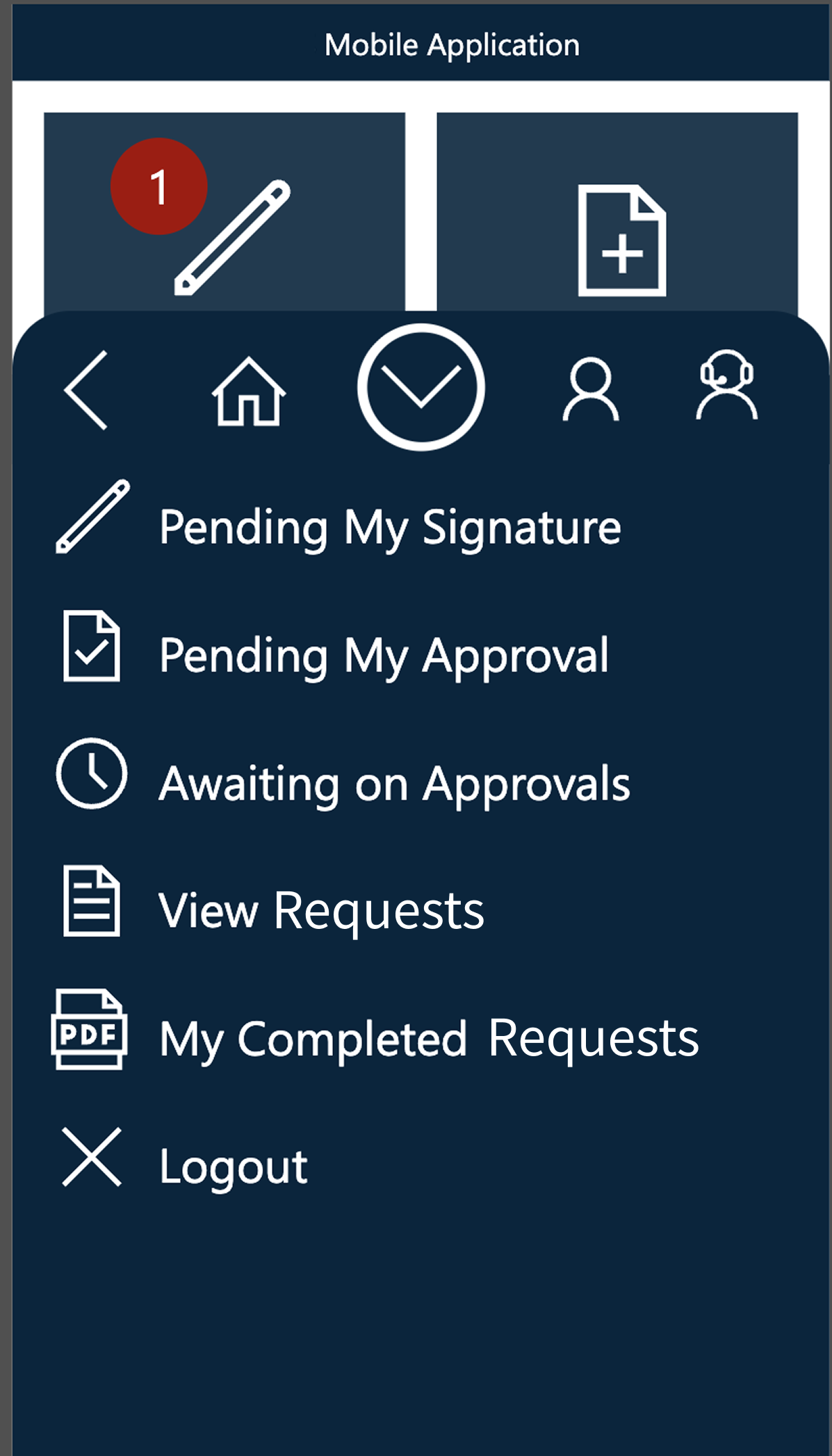
After speaking with stakeholders, end user, and developers to gain a holistic understand of the app, I collected screenshots of the whole application to map out all of the user journeys. From there I conducted a heuristic analysis.
Takeaways
UI seriously lacks visual hierarchy.
Navigation paths to specific screens are unclear.
Lack of labeling of buttons creates uncertainty with functions.
Lack of contextual labeling creates uncertainty with navigation.
Step 2
Understanding User Needs
I conducted interviews with end users to understand their workflows and requirements.
Key Requirements
• Ability to create subpoena requests from anywhere.
• Quick access to request status and monitoring.
• Ability to review and sign off on requests.
Current Concerns
• "The form is overwhelming. There's so much information being asked for all at once."
• "I'm afraid that i might change something by mistake"
Step 3
Designing for Mobile Constraints
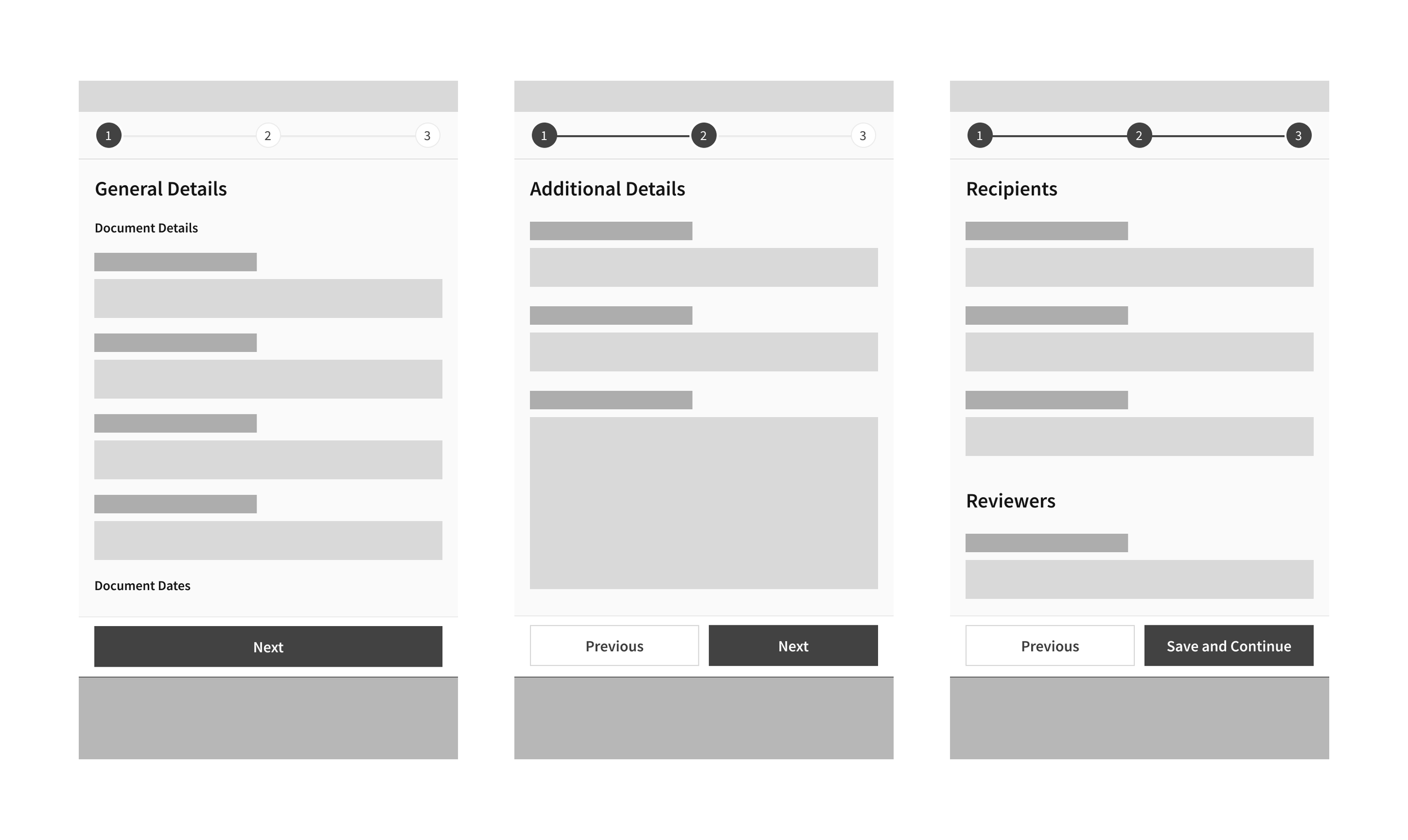
The desktop version presented 30+ form fields on a single screen. For mobile, I restructured this into a multi-step workflow.
Reasoning
• Reduces cognitive load by showing only 4-6 fields at a time
• Progress indicator shows users where they are in the process
• Allows users to edit any section before final submission
• Maintains all desktop functionality while optimizing for mobile
Step 4
Adapting The Design System
I leveraged the design system I had created for the desktop version of this application (which included established colors, typography, and component patterns).
Incorporating a Look & Feel
• Created mobile-specific navigation patterns (bottom nav + header)
• Adapted form components for touch targets and mobile interactions
• Optimized spacing and typography for smaller screens
• Ensured all components met iOS accessibility standards
Step 5
High Fidelity Designs
Following stakeholder sign off on both wireframes and look and feel, I designed high fidelity prototypes within Figma covering all core functionality and screens.
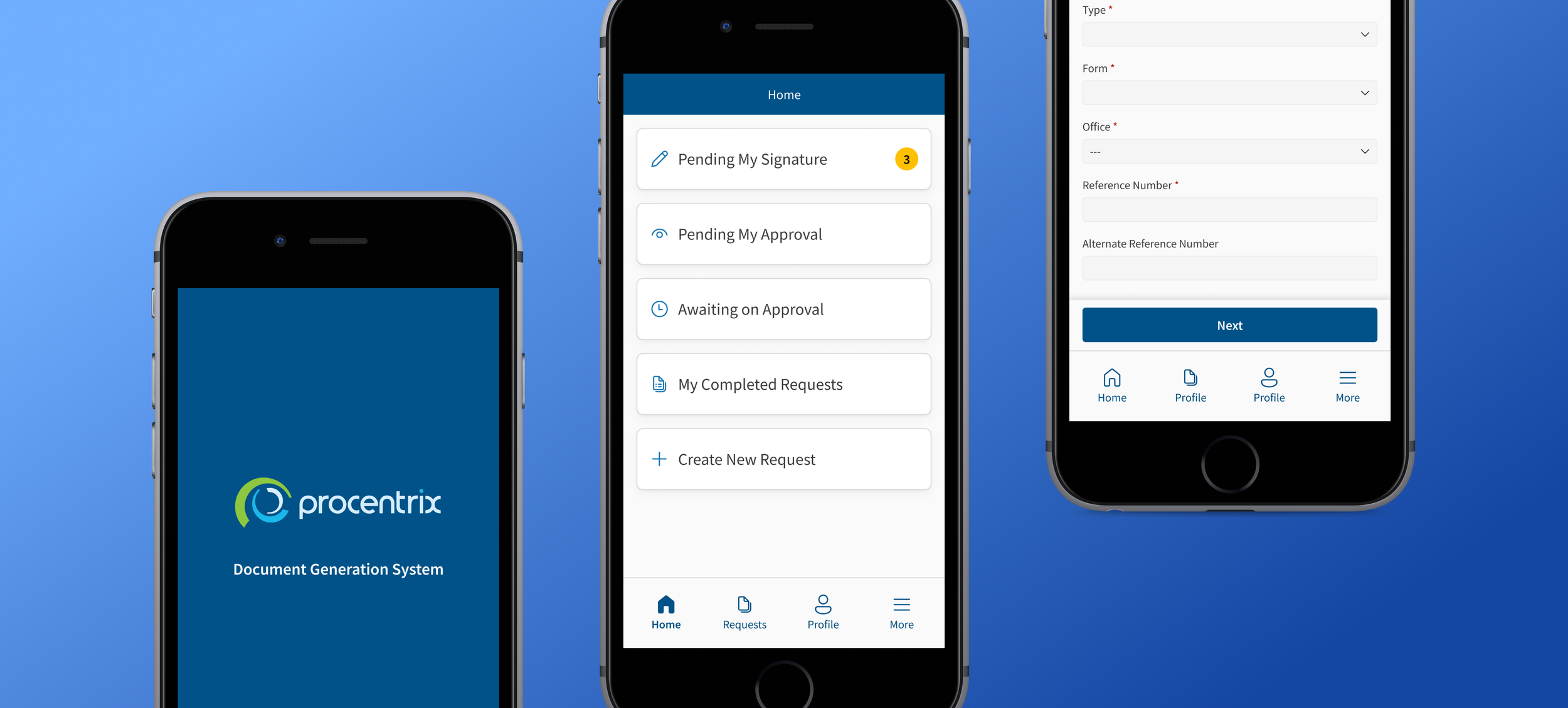
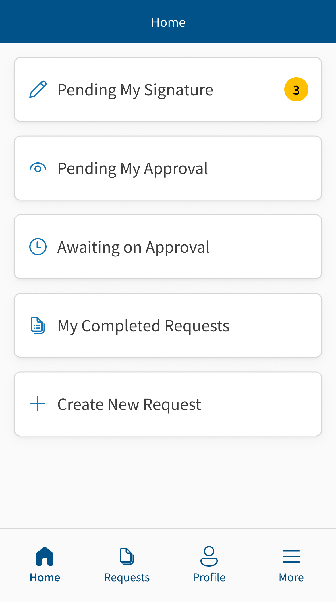
Multiple Entry Points for Flexibility
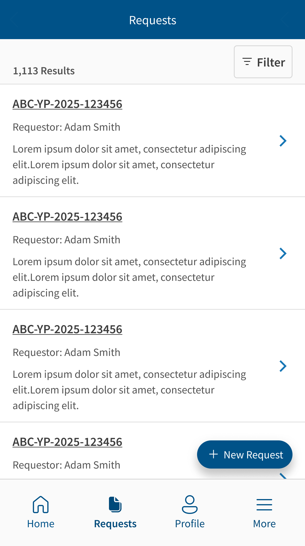
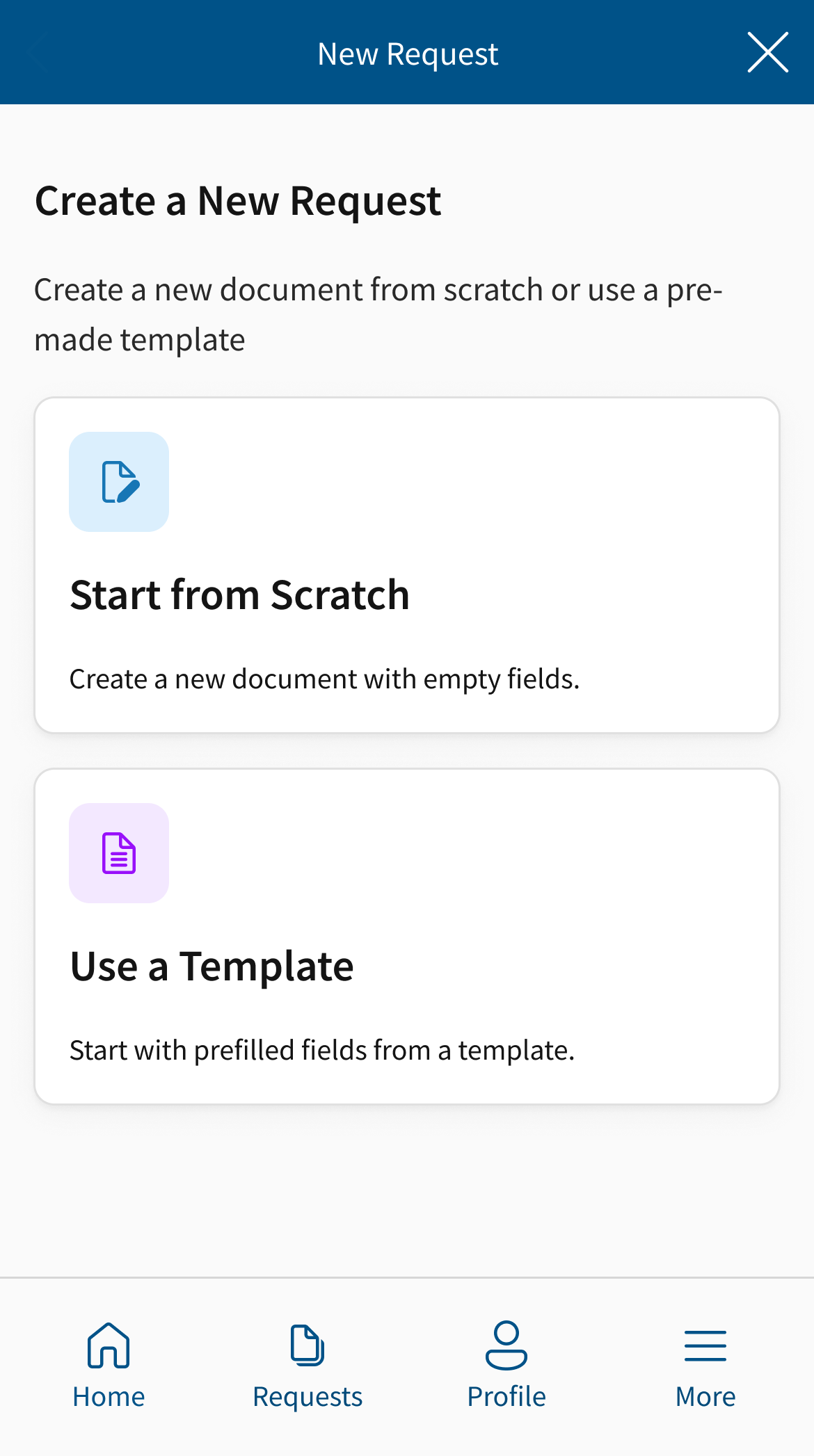
Users can trigger the the document creation workflow from their home screen as well as the Requests page.
Clear Navigation & Status Visibility
• Bottom navigation for primary functions (Home, Requests, Profile)
• Clear page titles and back buttons
• Request status indicators visible at a glance
• Notification badges for items requiring attention
Stepped Form Experience
• Progress indicator shows step X of 4
• Clear "Next" and "Back" navigation between steps
• Review screen shows all information before submission
Step 6
Validation & Stakeholder Feedback
Following completion of high-fidelity prototypes, I presented designs to a group of stakeholders and end users.
Stakeholder Response
Signed off of the development of proposed designs.
Described the new UI as a “Clean” and “Modern” aesthetic that matched the redesigned desktop app.
Felt the stepped approach for the creation workflow was intuitive and straightforward.
Impact & Next Steps
Designs have been approved and are currently in development. Application has not yet launched.
Expected Outcomes
• Field investigators will be able to create subpoena requests on-site, eliminating delays
• Reduced time spent in office on administrative tasks
• Improved user experience through modern UI and simplified form flow
• Increased mobile adoption due to core functionality now available
Next Steps
• Collaborate with development team on implementation
• Plan post-launch usability testing to validate design decisions
• Measure adoption rates and usage patterns once deployed
• Iterate based on real-world field usage data